Our Website Components
Page Content
Now, let's explore the Page Content, the heart of each page. Below, you'll find a list of all the components that you can use and combine to bring your careers hub to life.
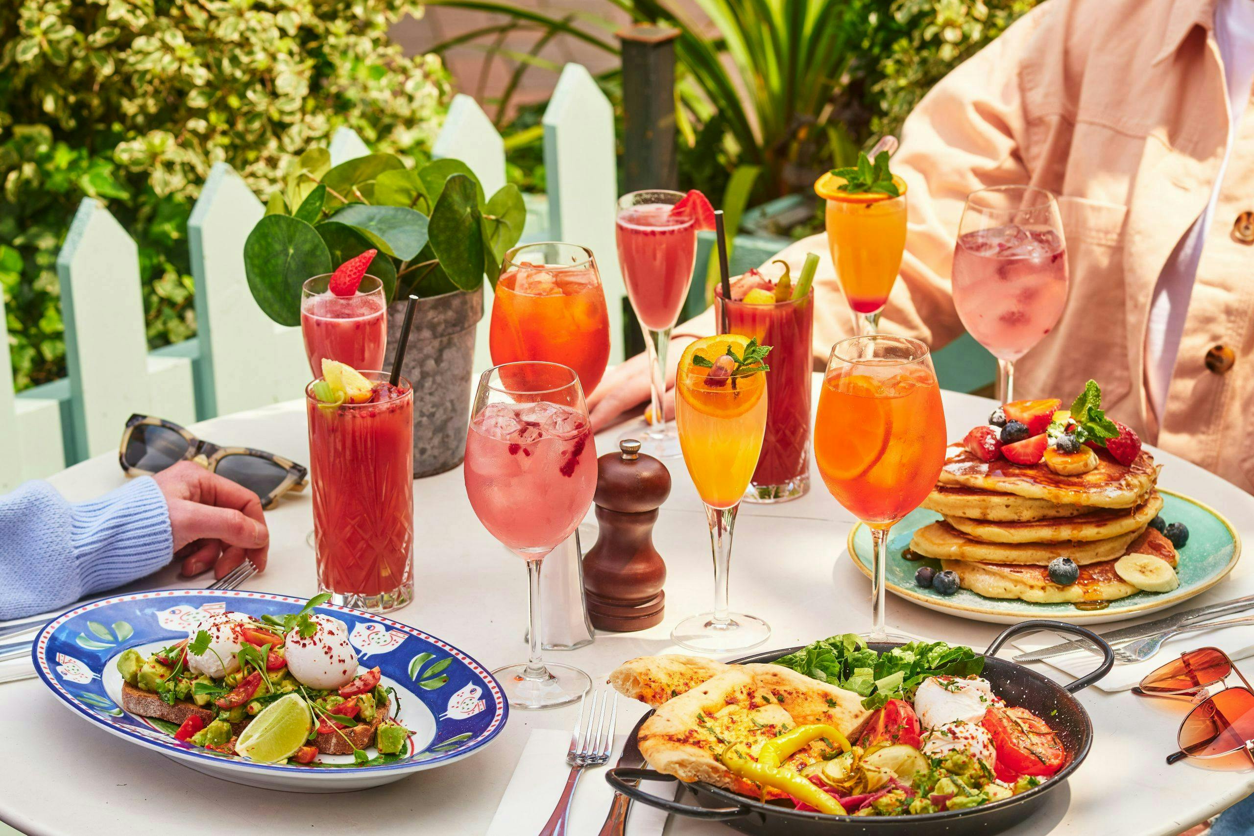
Two Block Component
Default setup: media on the right, text on the left, easily swappable. Customize text with title, subtitle, or none. Adjust alignment as needed: center text against media or align at the top/bottom, tailoring to your preferences.

Thriving
Passionate Evolution
We share a unique commonality—the sense of passion that motivates us to rise each morning, prepared for new challenges, regardless of the weather. It's the pride we feel as we witness our colleagues progress, grow, and shine.
Image
There is not much to say about this one - it's quite intuitive :)

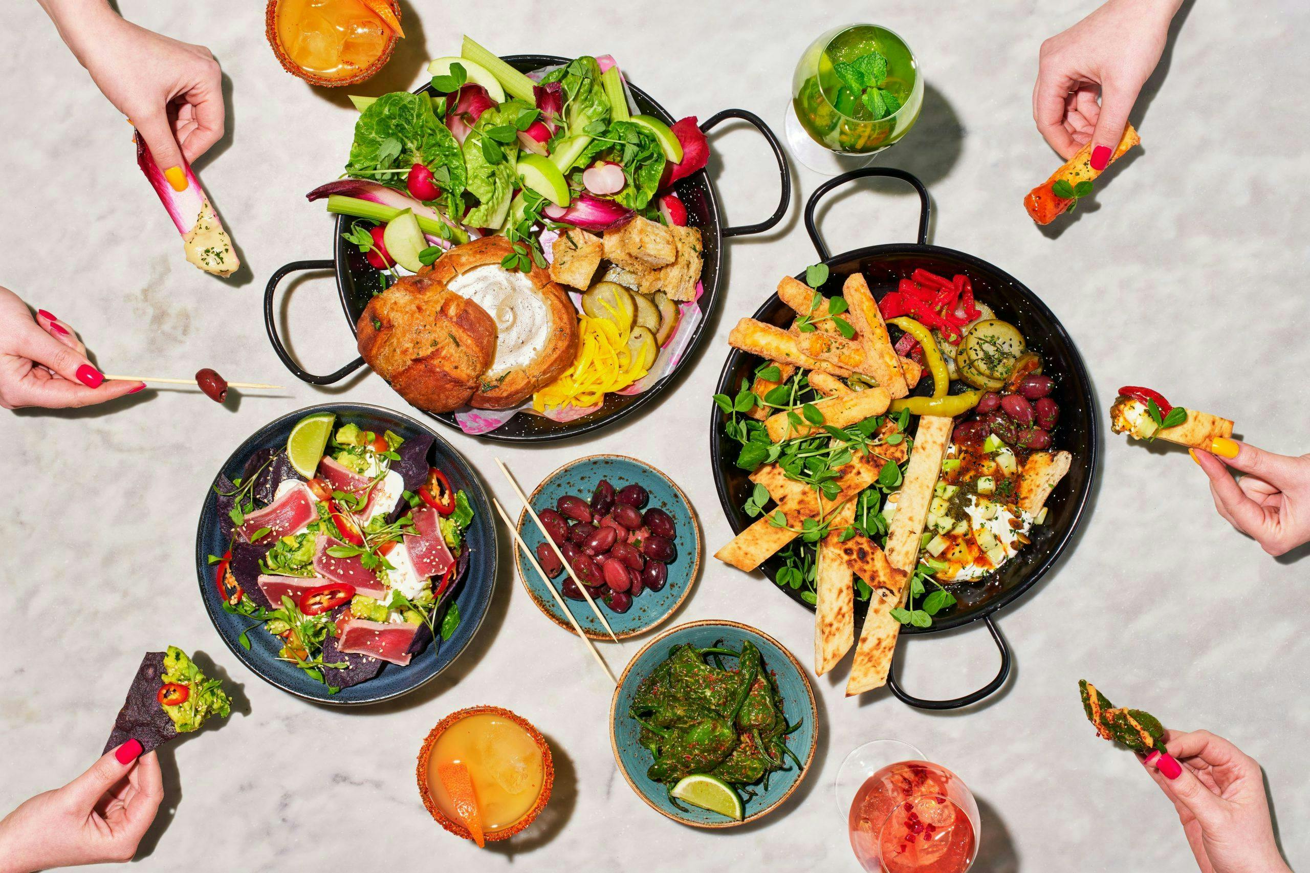
Image Carousel
This component enables the display of multiple images side by side. You can opt for automatic looping or allow manual scrolling by the user. Please see below:


Banner
The banner has two variations. It differs from a regular image as it allows you to add a title, subtitle, and a call-to-action (CTA), and these elements adapt for a good-looking display on different devices.

Join Us
And be part of something that matters
Video
This is the video component. You can opt to include a cover image or keep the video alone.
Please note that, by default, the video will be muted. Muting videos by default is a best practice to enhance user experience, considering potential disruptions in various environments and respecting user preferences. Users have the option to unmute at their discretion.
How to Love Your Work
Card Grid
This component allows you to have cards arranged side by side in different rows. It often used to display different role types or can also be used as a gateway to navigate to a different page.
There are four different variations: small, medium, large, and full-size, each corresponds to different image card sizes. With small and medium image cards, you can include both a title and a description. For large image cards, only a title can be included, and in the case of full-size images, it consists solely of the image itself.
In the examples below, we used 2 cards per row, but you can choose to have 3, 4, or any number depending on your preference and the total number of cards in the section.
Click on the roles below to find out more!

Sales Assistant
We are always actively seeking Sales Assistants who have a positive, can-do attitude, demonstrate a passion for our products, love serving customers ...

Assistant Manager
This role is all about delivering an exceptional shopping experience through your team.

Store Manager
As a Store Manager, your responsibilities revolve around ensuring the happiness of both our customers and team. You'll play a vital role in promoting...

Supervisor
One minute you will be rolling your sleeves up and mucking in, the next you will be managing and coaching your team
Card Grid on Image Background
This is simply the Card Grid component, as seen above, displayed over an image.
You can have a title here if you want
Store Manager
Assistant Manager

Warehouse Coordinator

Visual Merchandiser
Card Carousel
We have cards side by side again, but in this component, they are side by side on one single row. You can opt for automatic looping or allow manual scrolling by the user (similarly to the image carousel).
Again, these cards can be used as a gateway to navigate to a new page. We have 2 variants: In Option 1, you can have a title and description; in Option 2, only a title is available.
Work with Us
Joining our team offers a unique opportunity for professional growth and development, fostering a collaborative environment where your skills are valued and your contributions make a meaningful impact on our shared success
Be yourself
Being yourself at work is all about the right to feel comfortable in your work environment. You should be able to go to work without having to worry about what colleagues may think about you, you are there to do a job and deserve to do it without pretending to be someone that you're not.
Be part of the team
"The combined results of several people working together is often much more effective than could be that of an individual scientist working alone." — John Bardeen
Share your ideas
The integral part of workplace team work is the sharing of professional opinions with co-workers. The main beneficial fact of discussing varied view of points at workplace helps in encouraging brainstorming, leads to actual project planning and engenders new ideas.
Logo Carousel
This is a straightforward auto-scrolling carousel featuring logos. If you're a company with multiple brands, you can include their logos below and link them to their respective pages. Alternatively, it could feature partner logos.


Benefits
This component enables a clean visualisation of company benefits, which is an important element in of any EVP. Your distinct benefits will serve to attract top candidates, offer a competitive edge, foster employee satisfaction and retention, and contributing to a positive corporate image.
If you want to add a bit of animation, you have the option to make the icons dynamic. Check out benefits 1, 4, and 5 below.
Shift Tracker & Early Pay Access App
An application that enables you to monitor your shifts, track your monthly earnings, and access up to 40% of your pay before payday, providing flexibility in receiving your income. Additionally, it offers a range of other financial well-being features!
Everyday Savings Delight
Real savings on your everyday expenses, covering everything from your weekly groceries to enjoyable nights out with friends.
Healthcare Harmony: Your Family's Digital Wellness
We cherish this perk – providing you and your family with free access to digital healthcare services, including Digital GP, nutritional and mental well-being consultations, and an annual health check.
Learning and Development
At Inploi, everyone has the opportunity to learn and grow with our diverse array of online and in-person learning modules. We strongly believe in the continuous nature of learning, ensuring numerous learning moments throughout your journey, starting from day one!
Member & Family Discount
A fantastic discount for you & your family giving you 40% off all our products and, 20% on all other branded goods.
Recognition Scheme
We're proud to celebrate our teams and work that we all do. Offering internal recognition schemes and awards to thank our colleagues for everything that they do.
Honoring Your Work Milestones
We start recognising your work milestones right after your first year! Join us in celebrating the achievements of our team members, with career festivities kicking off at the one-year mark.
Effortless Donations for a Cause
Simplify your regular donations to a charity you care about with ease. Plus, it's tax-efficient, allowing you to give more while costing you less.
Title/Image Hover Block
This component enables the creation of interactive blocks with images and titles, seamlessly switching between the title with a colored background and an image. It's ideal for displaying roles or departments and can serve as a portal to another dedicated page.
Back of House
Front of House
Kitchen
Value Component
This component is designed to communicate the core principles and beliefs defining your company culture. It features a prominent image on the right, complimented by a title, a brief description, icons, and title-value pairs on the left. This versatile layout can also be used to showcase benefits, for instance.

Our Values
At our company, our values drive our culture and actions. From prioritizing customer satisfaction to fostering innovation, embracing diversity, and championing accountability, we are dedicated to excellence and collaboration, creating an environment where every team member can thrive.
Teamwork
We collaborate and support each other to achieve common goals.
Diversity and Inclusion
We celebrate diversity and create an inclusive environment where everyone feels valued.
Customer-Centric:
We prioritise the needs and satisfaction of our customers in everything we do
Innovation
We foster a culture of creativity and embrace new ideas to drive innovation.
Integrity
We uphold the highest standards of integrity in all our actions.
Two-Block Component with Switchable Text
This component resembles the two-block design at the beginning of the page, but with a fixed layout: text on the left and an image on the right. An added feature is the ability to navigate through the text content by pressing the arrow.
Crafting a Positive Candidate Journey: Key Steps to Success
1. Clear Communication: Provide transparent and timely communication at every stage of the recruitment process. Clearly outline the expectations, steps, and timeline, helping candidates understand what to expect.

Expandable Vertical Cards
This component is commonly used to present FAQs or illustrate processes. Below, you'll find a list of 'actions/questions,' and clicking on them reveals additional detailed information. Additionally, you have the option to experiment with fonts and colors.
To help you succeed, here are some valuable tips for your upcoming interview:
Relax, be yourself, and showcase your unique strengths. We look forward to meeting you and wish you the best of luck!
Text sliding on a video background
Company offsite
Step into the vibrant pulse of creativity and collaboration as you join our company offsite in the heart of New York. This transformative experience transcends the traditional workspace, offering a dynamic fusion of professional development, team-building, and cultural immersion. Nestled amidst the iconic cityscape, our offsite provides a unique opportunity for your team to explore innovative ideas against the backdrop of New York's energy. Engage in impactful workshops designed to enhance teamwork and ignite creativity. Immerse yourself in thought-provoking discussions and strategic planning sessions that propel your collective vision forward. As the sun sets over the city that never sleeps, unwind with your colleagues, fostering connections and camaraderie that extend beyond the boardroom. Our offsite is not just an event; it's an experiential journey that leaves an indelible mark on your team's synergy. Through shared adventures, cultural exploration, and collaborative breakthroughs, this New York offsite promises a transformative experience, solidifying bonds and fostering a culture of innovation that will resonate long after the trip concludes.
Tab Component
You've seen this component before, as we have used it to demonstrate various options for other components. The tab component allows you to switch between different tabs, displaying diverse content. Within these tabs, you can utilise different components to enhance the variety and functionality of your page.

Vertical tabs with 2-Block Component
This component enables the use of vertical slidable and expandable tabs, each featuring a 2-block content structure. The content includes an image on the left and text on the right, which is not switchable, providing a seamless and interactive user experience.
Discover Our Company
Dive into the world of our Company. Explore our values, mission, and the exciting projects we're passionate about. Simply search for our company to unveil the opportunities that await.
Apply for Your Ideal Job

Ready to make an impact? Browse our current job openings and apply for the role that aligns with your skills and aspirations. Take the first step towards a rewarding career with us.
Prepare for a Face-to-Face Interview

Congratulations on being selected! As you advance in the hiring process, get ready for a face-to-face interview. Be yourself, sharpen your insights into our company, showcase your unique strengths, and let's explore how you can authentically contribute to our success story.
Search Bar Component
This final component serves as the heart of the search page, emphasizing a clean design to avoid distracting candidates during their search. However, its versatility allows seamless integration into other pages. For instance, on a department page, like Sales, you can place the search component at the bottom, ensuring roles displayed are relevant to that department.
The initial feature is a search bar facilitating searches by job title, keywords, and location. Any number of custom search filters like full-time/part-time, job city, or job category can be added here, although not shown below.
The layout includes a job list on the left and an interactive map on the right, enabling candidates to search for jobs in preferred areas by zooming in or out. On mobile, only the job list is displayed. When a candidate clicks a job, three options appear on the right: Apply Now, View Full Job, and Share. Clicking "Apply Now" activates our chatbot for a seamless application process.
Feel free to explore this component and experiment with its functionalities to get a better understanding of how it works.
It looks like there are no results for this search. Click the button below to reset your filters.